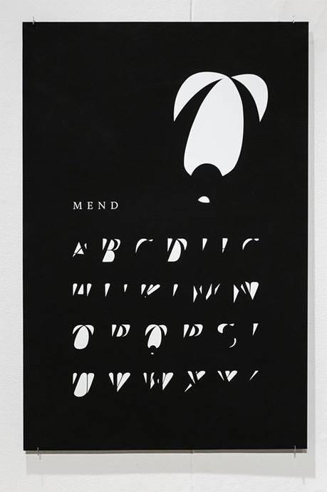
Inkjet print, 20″x36″, 2016
Mend Typeface play, After Effects animation

Process drawings, 2015
This study was created by overlapping 2 styles of the same typeface. Thinking about other ways to visually study memory, I likened this to overlapping 2 sides of the same story. After working with photography overlap studies, I wanted to explore type. While browsing The Library of Congress online archive I found a lettering manual, Standard Lettering by Roy C. Claflin, 1883. It contained various unnamed classic-appearing typefaces. I chose the Modern typeface with roman and italic style uppercase. I appreciated the ambiguity of the typeface’s origin as it allowed me to take a mental break from the earlier/heavier civil rights collages but still allowed me to explore memory and narrative.
*Photo Credit: Matthew Garin (first image)